School Project
Receipt App UI Case Study
December 2024
Qualitative Research · UI/UX Design · Figma Prototyping · Mobile Development
One of my favorite parts of coding is when I get to flex my creative muscles, explore a problem, and design an intuitive solution. At the end of my junior year, I took a course called Human-Computer Interaction where I conducted a 7-week UI/UX case study. The goal was to choose a problem domain and explore how to improve the user experience using the tools, frameworks, and principles that we discussed during the course. I applied heuristics and UX laws to my designs, held interviews and talk-aloud exercises, and tested lo-fi and hi-fi prototypes to inform my final solution. At the end of the course, I presented my finished prototype and the results of my research in a recorded video.
The problem domain I chose to investigate was how to split items on a bill when multiple people have ownership over multiple items. As someone who lives with roommates, I found it tedious to go through receipts from the grocery store and split items accurately when I would pick up a few things for other people or buy items that we all shared. At the time I started this course I was already working on a side project that used an LLM to extract item information from a receipt image, and a mobile interface to split the cost of those items among friends. I saw this project as a good opportunity to improve my app's usability and design.
Conducting UI/UX research
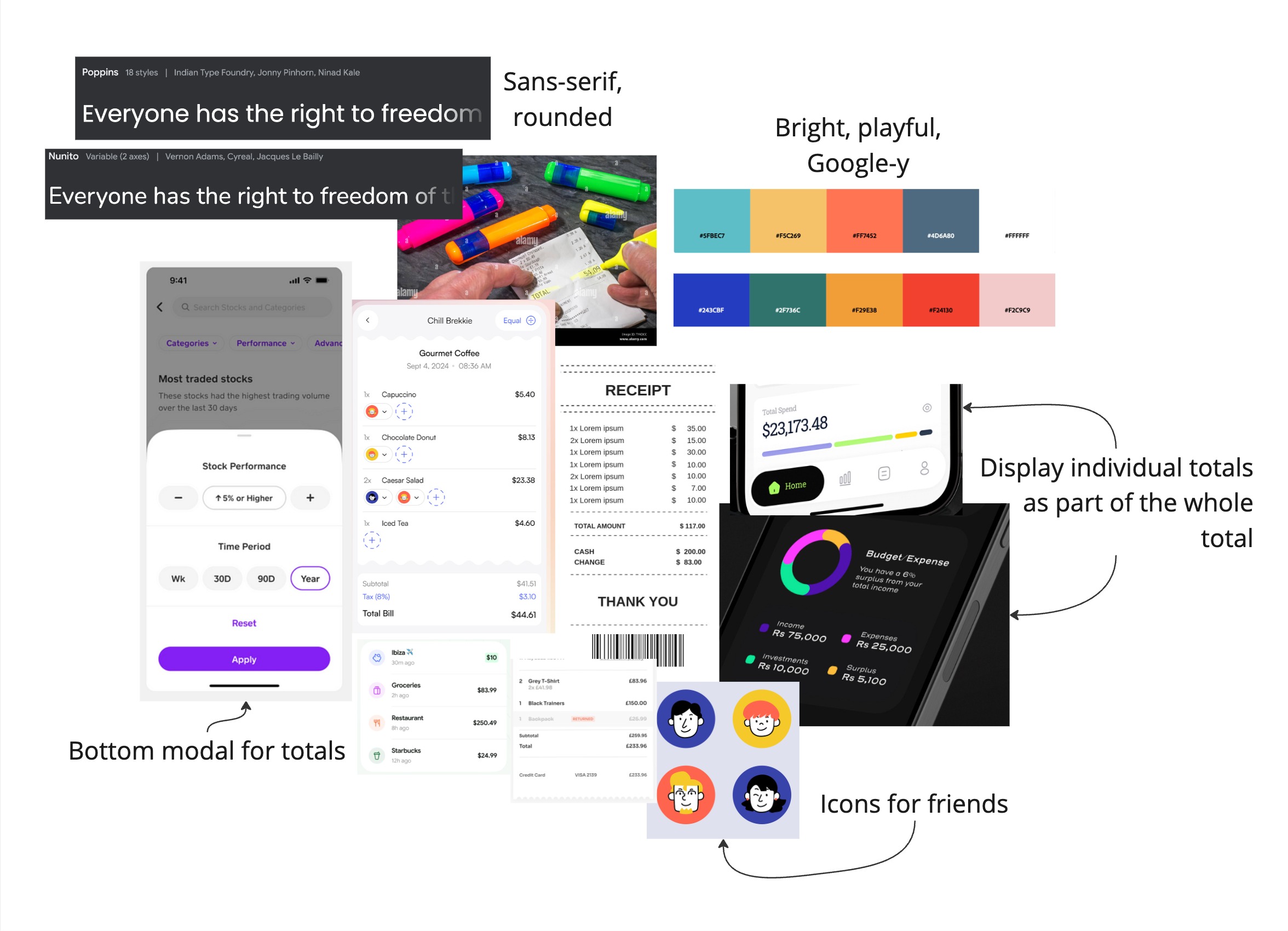
At the beginning of the course, I got to learn about some of the fundamental concepts of Human-Computer Interaction such as the double-diamond approach and human-centered design. I also refined my project proposal to focus specifically on the use case of assigning friends to receipt items, displaying those items in a list, and viewing the final totals. From there I designed a moodboard to capture my initial ideas and created some lo-fi sketches of relevant UI components. Throughout this process I was constantly thinking about who my target audience was, and how I could make my design coherent and intuitive.
 Moodboard with initial thoughts and visual direction
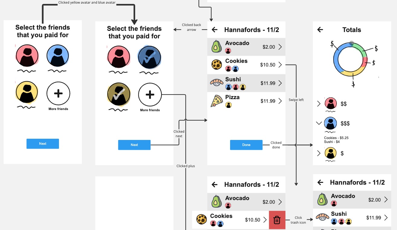
Once I had my first lo-fi prototype prepared, I conducted a talk-aloud and an evaluation using heuristics with some classmates. The exercises revealed several issues that made my current design confusing or frustrating. The feedback that I received helped me realize that I should make more use of text and labels in my prototype, and that I should use visuals that summarize information from other pages without requiring the user to click on an item again.
 Lo-fi prototype of selecting friends and assign them to items on a receipt
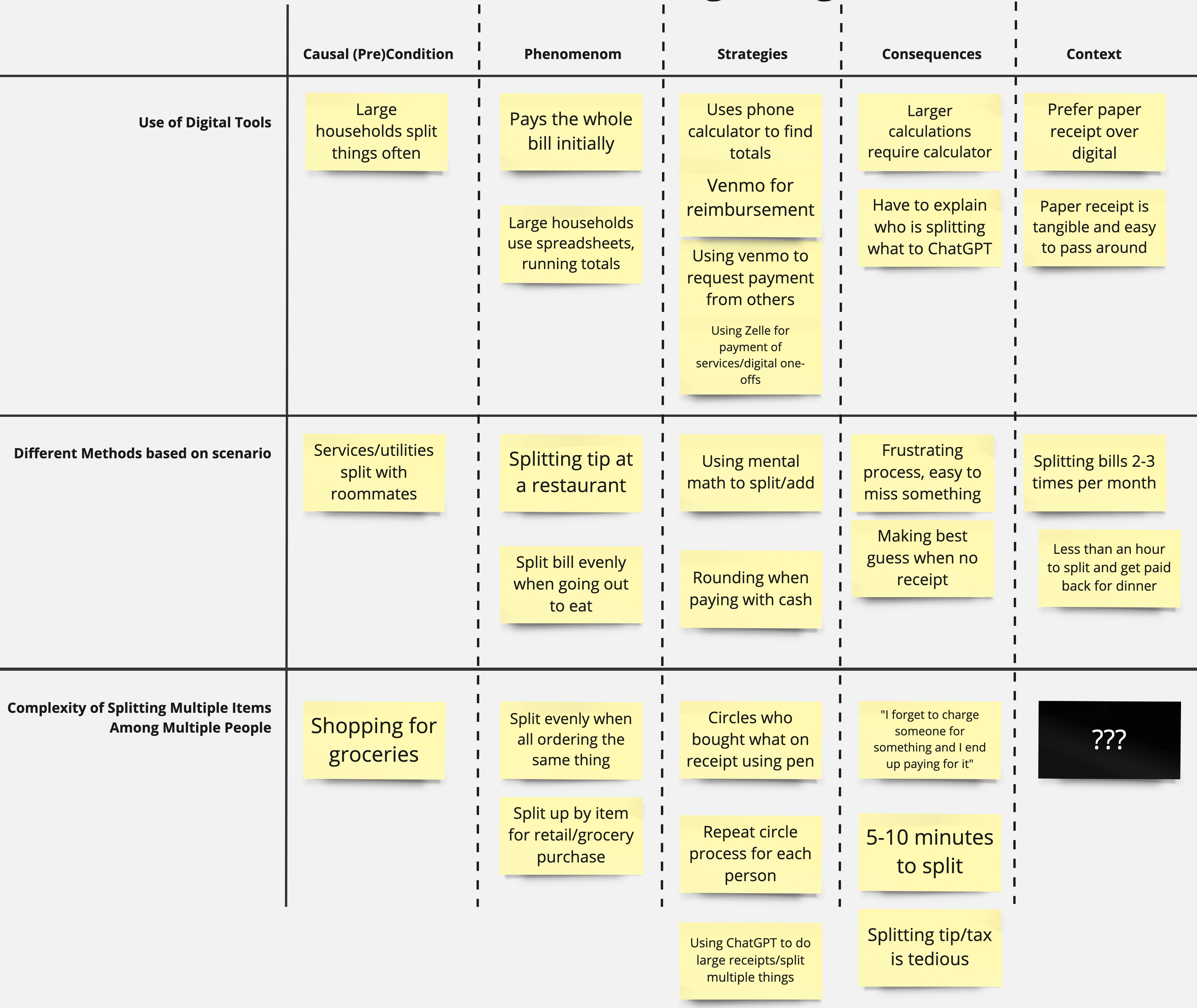
To understand the pain points and needs of my target audience, I interviewed two college students who regularly split bills with their friends or household. I wanted to know more about what techniques and tools they currently use to split a receipt, and how they handle parsing through complex receipts. After collecting the interview responses, I used open coding to derive categories and classify common points from my interviews in a diagram. Based on that data, I developed a theory: the current methods for splitting receipt items are tedious and prone to error so users will either change their approach to make the task easier, or use digital tools to assist them.
 Axial diagram of coded interview data
Next, I derived two hypotheses that I could test to prove my theory:
Hypothesis 1: When splitting a receipt users prefer to go person by person as opposed to item by item when assigning who is paying for what.
Hypothesis 2: When given an easier and more intuitive way to split a receipt than by hand, users are more likely to choose to split up a receipt by items as opposed to splitting the entire bill evenly.
Testing my hypothesis
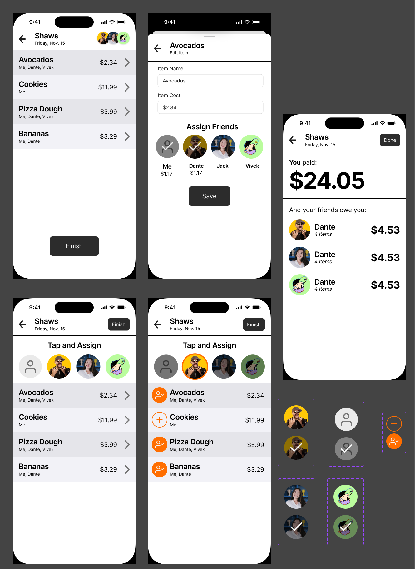
I chose to create a within-subjects A/B test for my first hypothesis, using grounded theory to operationalize my variables. I created two hi-fi prototypes using Figma and HTML: one flow to act as a control which requires you to tap on an item and then assign it to a friend, and another flow that has all your friends at the top of the item list so you can quickly assign a friend to multiple items. The idea behind this is that the control flow is more suited to an item-by-item technique, while the alternative flow is optimized for person-by-person assignment. Each test subject was given a fabricated receipt and a corresponding group chat transcript where a few friends discuss what they need from the grocery store.
 Hi-fi Figma prototype with two flows for assigning friends to receipt items
To test the effectiveness of each method, I recorded how long it took to complete the item assignment, how many mistakes were made, and how many times the user went back to fix a mistake. At the end of the A/B test, I also asked each participant which flow they preferred and what they found confusing or frustrating about the process.
The results of the A/B test revealed that the intended improvements of the alternative flow were not necessarily better in all aspects. For example, the completion time for the alternative flow was about 60% slower than the completion time for the control flow. However, when asked about which design they preferred using, users chose the alternative flow despite the time difference. This supports the hypothesis I chose to test, but the results made me reconsider how the setup of the test may have effected the outcome. For instance, users may have been more efficient using the alternative flow if they had been handed a shopping list for each friend instead of a group chat dialogue. Overall I concluded that users prefer flexibility and responsiveness even if it comes at the cost of time. This finding aligns with UI principles such as the aesthetic usability effect and Doherty's threshold - it upholds the idea that a responsive and visually appealing UI will cause users to forgive its limitations.
Takeaways
This case study project greatly improved my qualitative research skills, introduced me to core principles of UI/UX, and expanded my competency of prototyping tools like Figma. As a graphic designer and a web developer, the visual appeal and familiarity of the projects I create is always top of mind. This class and the corresponding project helped me understand the importance of designing for all stakeholders, as well as how to use grounded theory, user research, and UI/UX laws to inform my work. While some of the test results were unexpected, I now understand how to conduct a proper A/B test going forwards and can iterate on my research to improve the efficacy of those tests. Looking forwards, I am excited to apply these skills to my upcoming projects as I continue to work on creating intuitive, human-centered, and enjoyable experiences.