CARTER MOORE
CARTER MOORE
Branding Development
2023
Last year, I had the opportunity to help rebrand a medical device start-up that was founded by Professor Solomon Mensah from WPI. Therapeutic Innovations is reimagining and reengineering existing medical devices for use in underdeveloped countries around the world. Having already developed a brand identitiy for MeDHigh (Prof. Mensah's educational summer camp program at WPI), I was asked if I wanted to help with rebranding his medical device company as well. Together with Eli, Lisa, and Stephen from the marketing team, we were able to develop a comprehensive and impactful brand vision that fully encapsulated the company's values.
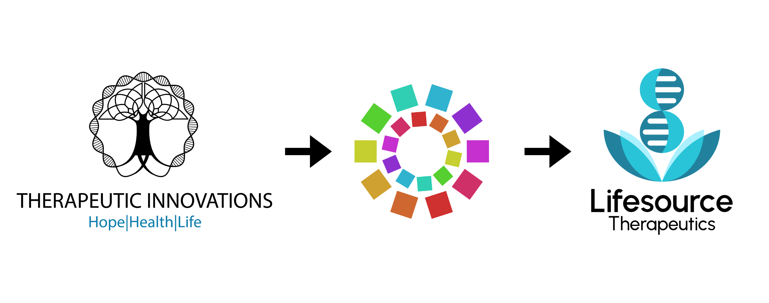
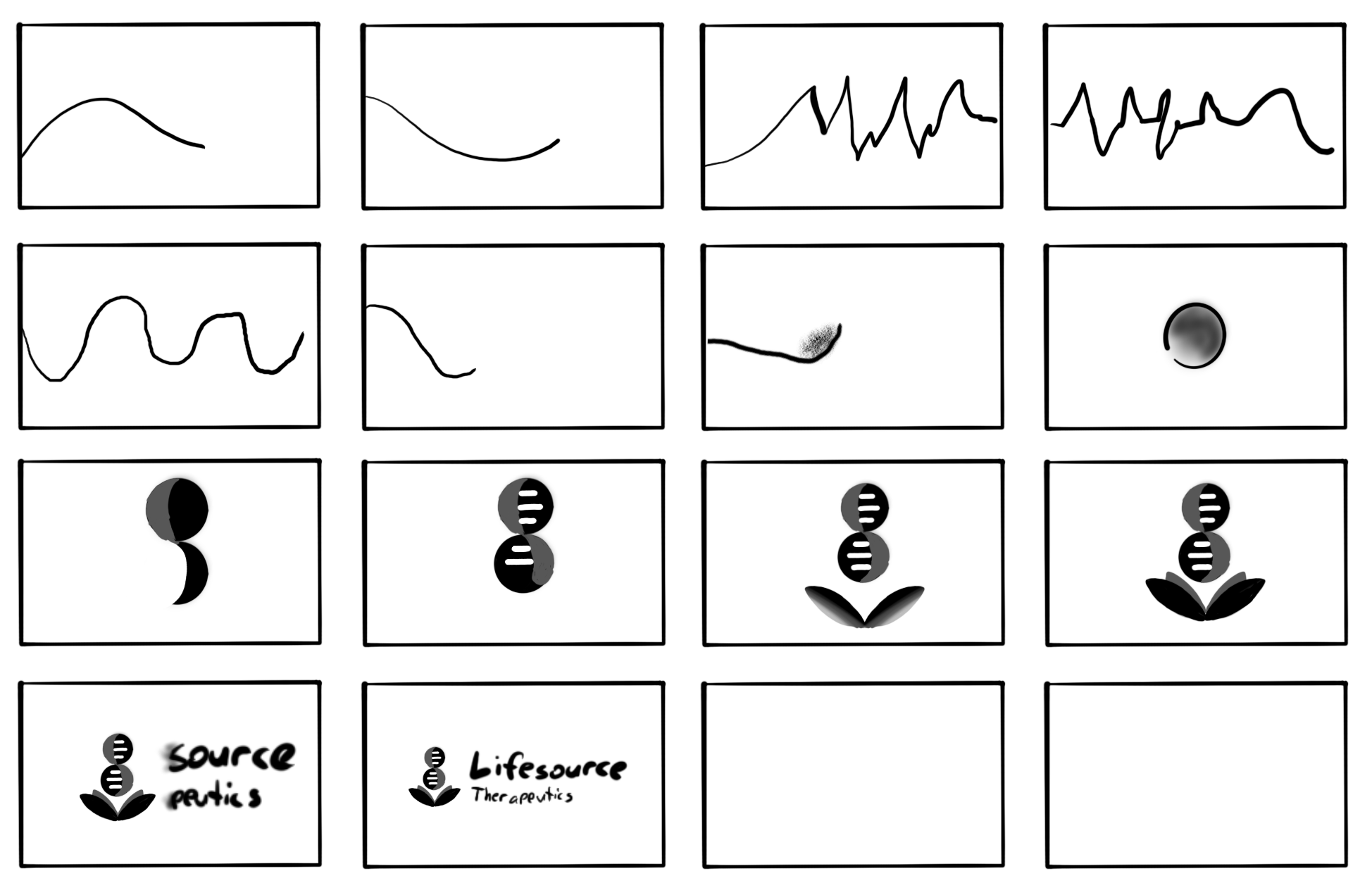
The evolution of a new brand image went through numerous iterations over time. One of the earliest concepts was a multi-colored, circular logo that embraced connection and the iterative process of reengineering that was akin to the company's mission. The concept was clean, professional, scalable, and translated well to the line of products that the company could develop. The name "neonation" was also an early attempt to incorporate global health and renewal into the new brand vision.
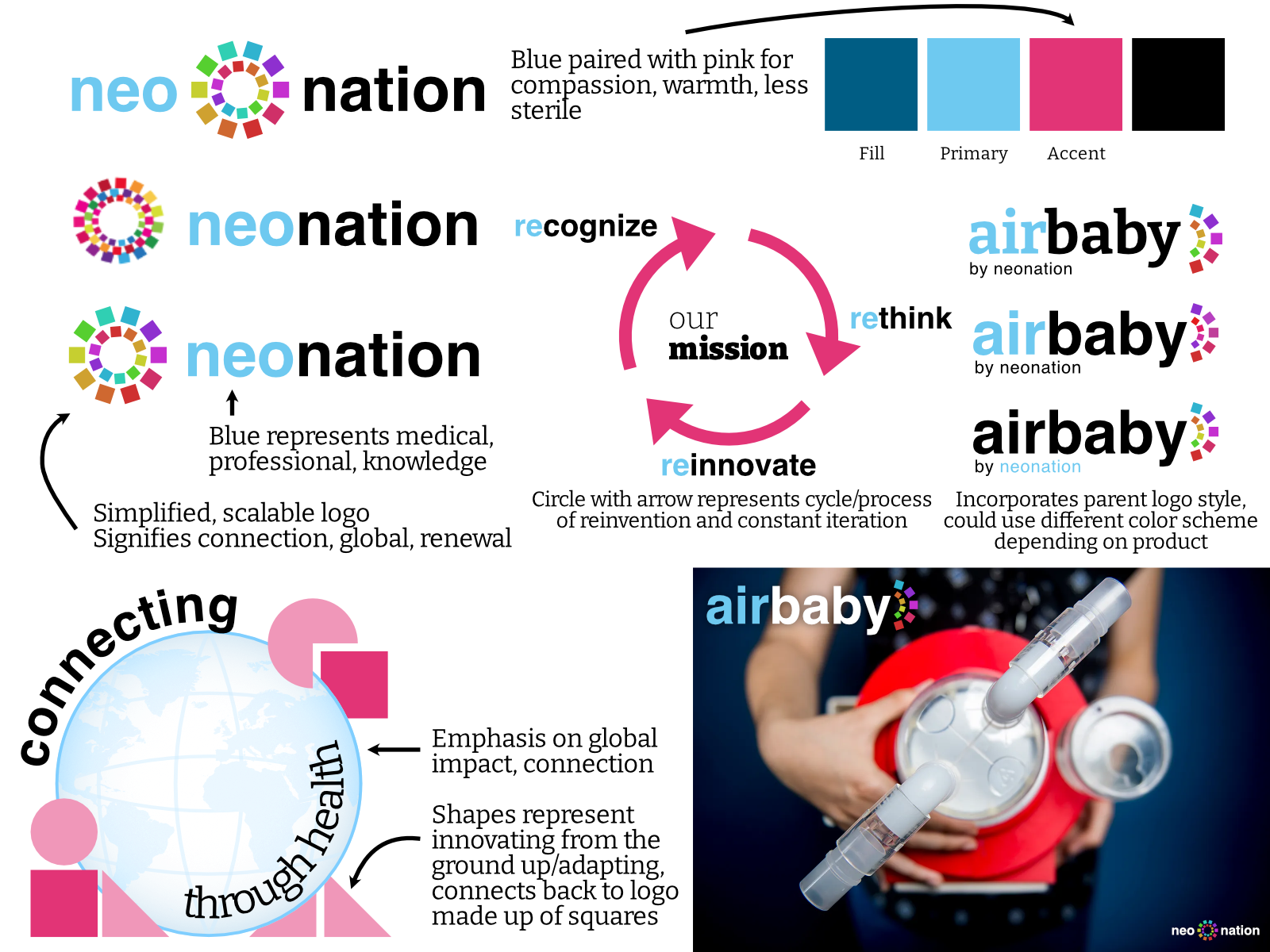
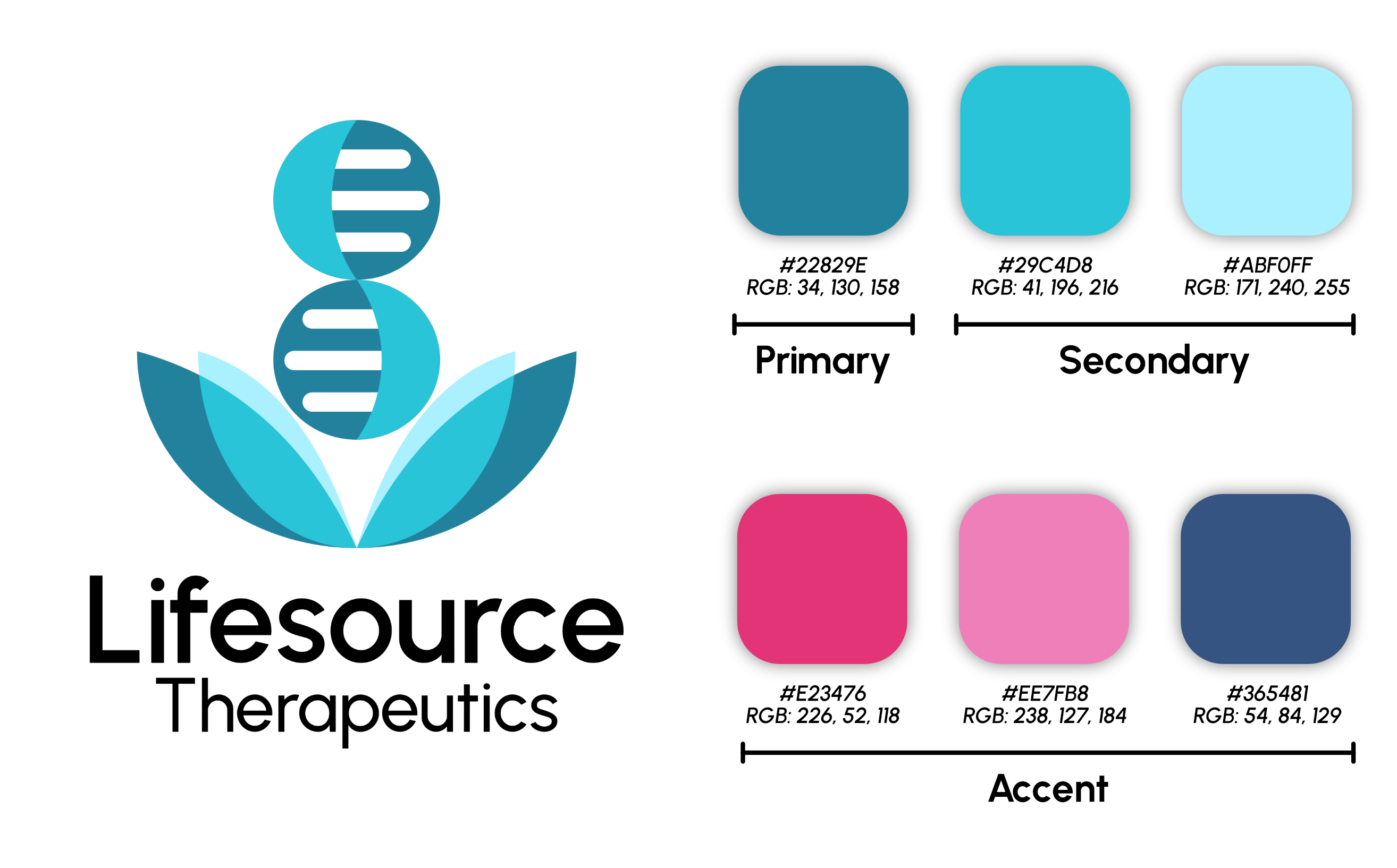
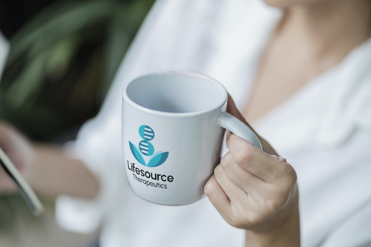
While this concept was professional and eye-catching, the team agreed that the rebranding had to be softer, more evocative, and more personal. For that reason, we scrapped the original concept and started from scratch with the goal of coming up with a more approachable design. We experimented with countless different names and logos until finally landing on Lifesource Therapeutics and a logo with a blue DNA strand emerging from leaves. This logo symbolizes the core of life which is the DNA emerging from some origin or source which are the leaves. The blue color indicates a healthcare-related company, but still feels inviting.
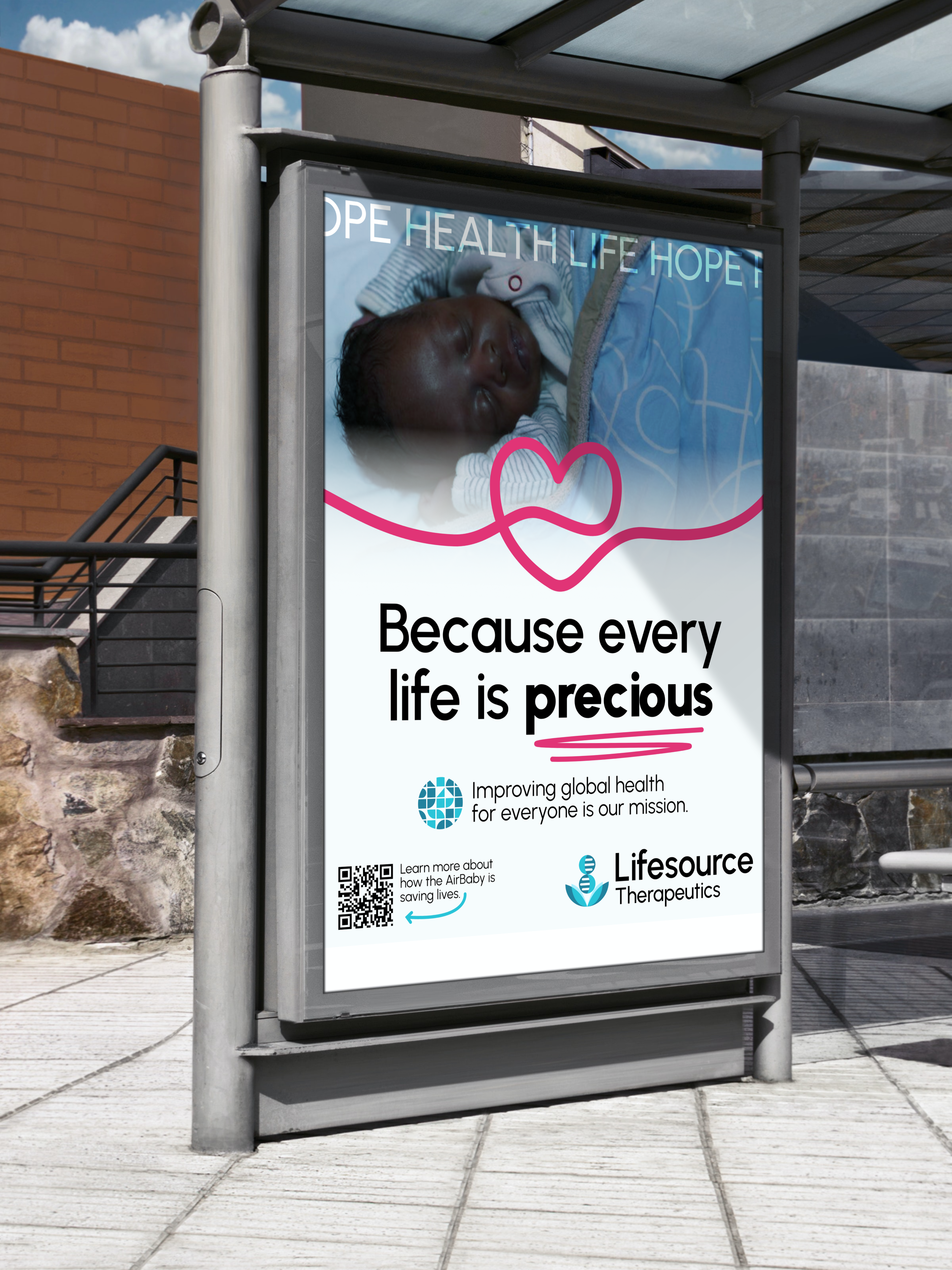
All of the visuals were designed using Affinity Designer - a tool similar to Adobe Illustrator. The final concept was fledged out to include subsequent product branding, multiple logo variations for different formats, animation and product mockups, and a color and font scheme.

By the time I left this role, some unforseen legal obstacles prevented us from implementing this final concept in the rebranding of the company. However, I am extremely proud of what the team and I were able to accomplish in the time that I worked with them. If nothing else, I learned extremely valuable lessons about effective communication, accepting feedback, and brand development. My growth as a graphic designer and as a person is something that I am proud of and I am so grateful to have had the opportunity to contribute towards a company that is doing signifcant good for our world.
Brand Development · Communication · Concept Presentation · Creative Research